
Last week, the Advanced Drawing and Painting Studio classes went to the de Young museum to see the exhibition “Modernism from the National Gallery of Art.” Students were struck by the magnificent size of many of the works, and amazed by the layering of paint and materials. Three students shared their reflections with us.
 “This painting is wild and dynamic, with colors leaping off of the canvas. Everywhere I look I see faces and hidden figures. It makes me feel vivid and electric and a little messy-crazy. It looks like Dubuffet built individual pieces on paper, then cut them up and pieced them together on a canvas. The brush strokes are bold and sketchy for the most part, but there are also areas where the lines are thick, opaque and smooth. The layering of painted paper on the canvas is balanced, like a patchwork quilt. There are clear patterns of repetition, such as the faces/bodies, which I see many variations of in different color palettes and with different line qualities and shadings.” – Kealey ’15 on La ronde des images by Jean Dubuffet
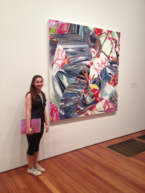 “I decided to focus on James Rosenquist and his Speed of Light oil painting. I was initially interested in this piece because of all the colors and how fluid it all looked. If I had seen this a week ago, I might say it had inspired the Running with a Theme project that we are working on in class. This painting is really interesting because from far away, it looks like twisted tin surrounded by a bunch of colors. The reflection on to the tin is so realistic from far away and then you get really close to the work and at least for me, I was really quite stunned at how smudgy and relaxed his strokes seemed. It was fascinating…Now, I kind of want to try something this big and see what I can do with being relaxed while still evoking some sort of realism in something more abstract, like Rosenquist has done.” – Sara ’15
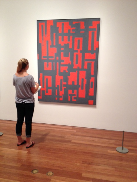 “Red and Grey by Ad Reinhardt was my favorite piece in the Modernism exhibit. The red and grey abstract designs contrasted colors in a very interesting way. The detailing in the layout of the red on the all grey canvas made it difficult to figure out which was laid on top of the other, red or grey- which pulled me in to look closer to understand how to painting was created.” – Savannah ’15
